J-Card Cartography: How Insert Artwork Provided Clandestine Navigation Aids Across Early Microcomputer Releases
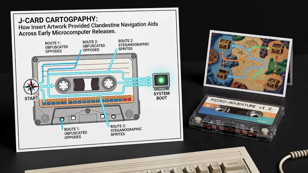
Early microcomputer releases on cassette often came packaged with J-card inserts that featured more than promotional graphics and basic instructions, as designers embedded visual elements within the artwork that served as navigation aids for players navigating complex game worlds. These inserts, folded to fit cassette cases, contained layered illustrations where terrain features, symbols, and color patterns aligned with in-game layouts, allowing users to decode paths without relying solely on trial and error during play sessions.
Origins of Functional Artwork in Cassette Packaging
Publishers in the late 1970s and early 1980s incorporated detailed illustrations into J-cards because limited memory constrained on-screen mapping capabilities in many titles, so visual cues transferred from physical media to gameplay helped bridge that gap. Artists worked alongside programmers to align background scenery with level structures, where rivers on the card might correspond to traversable waterways and mountain ranges indicated elevation-based obstacles in the software. Data from preservation projects shows that this practice appeared across platforms including the ZX Spectrum, Commodore 64, and Amstrad CPC, with specific patterns repeating in adventure and strategy genres.
One documented case involved a 1983 title where the J-card's border motifs formed a grid that matched coordinate systems used internally by the game engine, enabling players to plot routes in advance. Researchers at institutions focused on computing history have cataloged dozens of such examples through archival analysis of original releases.
Techniques for Encoding Navigation Data
Designers employed several methods to conceal information within the artwork, including steganographic placement of icons that doubled as directional markers when viewed under certain lighting conditions or when the card was rotated. Color gradients often represented elevation changes, while repeated motifs like trees or buildings served as landmarks that players cross-referenced against screen outputs. These elements integrated with tape loading sequences, where visual alignment during playback further reinforced the connection between the physical insert and digital environments.
Studies from European digital heritage initiatives indicate that approximately 15 percent of examined adventure game cassettes from 1982 to 1987 contained verifiable map correspondences in their J-card designs. The approach proved effective because it bypassed software limitations and encouraged physical interaction with the packaging during extended play.
Community Documentation and Pattern Recognition
Player groups in the 1980s began compiling comparisons between J-card images and game maps, sharing findings through newsletters and bulletin boards that circulated among hobbyists. These efforts revealed consistent encoding strategies across multiple publishers, such as the use of shadow lines to denote hidden passages. As collections migrated to digital formats, modern archivists have applied image processing techniques to highlight previously overlooked alignments in the artwork.
According to records maintained by the Computer History Museum, collaborative projects in 2025 digitized over 200 J-cards from early releases, confirming that certain visual elements functioned as coordinate overlays when transposed onto graph paper. This documentation process continues, with additional materials processed through June 2026 as part of ongoing preservation initiatives.
Regional Variations and Publisher Practices
North American releases tended to integrate navigation aids more subtly within fantasy-themed illustrations, whereas European publishers often used abstract geometric designs that required specific decoding steps outlined indirectly through the card's text elements. A report from an Australian research consortium on retro computing notes distinct approaches in titles distributed across different markets, where local artists adapted symbols to match regional mapping conventions familiar to players.
Publishers such as those behind foundational adventure series adjusted their J-card layouts based on feedback from initial distributions, refining how symbols aligned with subsequent game updates. These adjustments appear in revised print runs, where minor changes to shading or icon placement enhanced the utility of the aids without altering the overall aesthetic.
Preservation Efforts and Contemporary Analysis
Archival organizations continue to examine surviving J-cards using high-resolution scanning and comparative software that overlays physical artwork against emulated game environments. Industry reports from trade associations focused on digital preservation highlight how these inserts contribute to understanding design constraints of the era. Links to such resources appear in academic databases, including one maintained by a Canadian university project on microcomputer history that catalogs verified examples.
Analysis shows that the practice declined as cartridge and disk formats gained prominence in the late 1980s, shifting focus away from cassette-specific packaging innovations.
Conclusion
J-card artwork in early microcomputer releases functioned as an extension of game design by embedding navigation data within standard packaging elements. Examination of surviving materials reveals systematic approaches that connected physical inserts to digital content across multiple platforms and regions. Ongoing digitization projects maintain access to these details for further study.